How to make a responsive wordpress theme using twitter bootstrap
Getting started responsive wordpress theme
Before you begin creating a twitter bootstrap enabled responsive wordpress theme layout, you need to create the same basic theme layout using css/html. Let’s download the latest twitter bootstrap version. Once you download it, extract it into a folder where you going to create your responsive wordpress theme basic layout. Once you extract you will see a folder structure as follows;
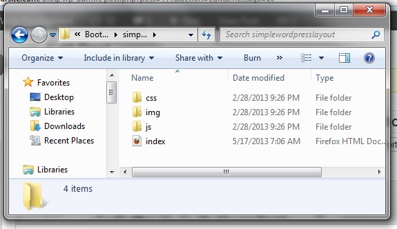
The index.html was the file we have created to build the simple responsive wordpress theme layout. Lets look at how we can build a simple responsive wordpress theme layout look like below;
Building the HTML/CSS responsive layout with Bootstrap
Twitter bootstrap works on html5 and any other html form. A basic html5 file structure outline is displayed in the below code
<!DOCTYPE html>
<html lang="en">
    <head>
        <meta charset="utf-8" />
        <title></title>
    </head>
    <body>
    </body>
</html>
Lets add the bootstrap references to the above html5 code. Once you added bootstrap references into above code it will look as follows;
<!DOCTYPE html>
<html lang="en">
    <head>
        <meta charset="utf-8" />
        <title></title>
        <!--To give better divice support-->
        <meta name="viewport" content="width=device-width, initial-scale=1.0">
        <!--Bootstrap core css file-->
        <link href="css/bootstrap.min.css" rel="stylesheet">
        <!--To add responsive effects to the layout-->
        <link href="css/bootstrap-responsive.css" rel="stylesheet">
    </head>
    <body>

        <!--For adding jquery effects to the layout in case-->
        <script src="https://code.jquery.com/jquery.js"></script>
        <!--Bootstrap javascripts required for the layout-->
        <script src="js/bootstrap.min.js"></script>
    </body>
</html>
Now your html layout is fully integrated with bootstrap. You can use all the rich features of twitter bootstrap in your responsive wordpress theme layout now. In twitter bootstrap all what you are going to do will be refer twitter bootstrap css classes to built your desired layout. You can start doing this by copying the very basic layout sample from bootstrap site. Once you complete the above responsive wordpress theme layout, your code will look like as follows;
<!DOCTYPE html>
<html lang="en">
<head>
    <meta charset="utf-8" />
    <title></title>
    <!--To give better divice support-->
    <meta name="viewport" content="width=device-width, initial-scale=1.0">
    <!--Bootstrap core css file-->
    <link href="css/bootstrap.min.css" rel="stylesheet">
    <!--To add responsive effects to the layout-->
    <link href="css/bootstrap-responsive.css" rel="stylesheet">
    <style type="text/css">
        .border
        {
            border: solid 1px #000;
        }
        .topmgn10{margin-top:10px;}
    </style>
</head>
<body>
    <header>
        <div class="container text-center border">
            <h2>
                Header section</h2>
            <ul class="nav border inline">
                <li><a href="#">Home</a></li>
                <li><a href="#">Examples</a></li>
                <li><a href="#">Contact us</a></li>
                <li><a href="#">About us</a></li>
            </ul>
        </div>
    </header>
    <div class="container text-center topmgn10">
        <div class="row-fluid">
            <div class="span9 border">
                <h2>
                    content section</h2>
                    <div class="span11">
                <p class="text-left">
                    It is a long established fact that a reader will be distracted by the readable content
                    of a page when looking at its layout. The point of using Lorem Ipsum is that it
                    has a more-or-less normal distribution of letters, as opposed to using 'Content
                    here, content here', making it look like readable English. Many desktop publishing
                    packages and web page editors now use Lorem Ipsum as their default model text, and
                    a search for 'lorem ipsum' will uncover many web sites still in their infancy. Various
                    versions have evolved over the years, sometimes by accident, sometimes on purpose
                    (injected humour and the like).</p>
                <p class="text-left">
                    It is a long established fact that a reader will be distracted by the readable content
                    of a page when looking at its layout. The point of using Lorem Ipsum is that it
                    has a more-or-less normal distribution of letters, as opposed to using 'Content
                    here, content here', making it look like readable English. Many desktop publishing
                    packages and web page editors now use Lorem Ipsum as their default model text, and
                    a search for 'lorem ipsum' will uncover many web sites still in their infancy. Various
                    versions have evolved over the years, sometimes by accident, sometimes on purpose
                    (injected humour and the like).</p></div>
            </div>
            <div class="span3 border">
                <h2>
                    sidebar section</h2>
                <div class="span11">
                    <ul class="nav text-left">
                        <li><a href="#">Home</a></li>
                        <li><a href="#">Examples</a></li>
                        <li><a href="#">Contact us</a></li>
                        <li><a href="#">About us</a></li>
                    </ul>
                </div>
            </div>
        </div>
    </div>
    <footer class="topmgn10">
        <div class="container border text-center">
            <h2>
                footer section</h2>
            <ul class="nav border inline">
                <li><a href="#">Home</a></li>
                <li><a href="#">Examples</a></li>
                <li><a href="#">Contact us</a></li>
                <li><a href="#">About us</a></li>
            </ul>
        </div>
    </footer>
    <!--For adding jquery effects to the layout in case-->
    <script src="http://code.jquery.com/jquery.js"></script>
    <!--Bootstrap javascripts required for the layout-->
    <script src="js/bootstrap.min.js"></script>
</body>
</html>
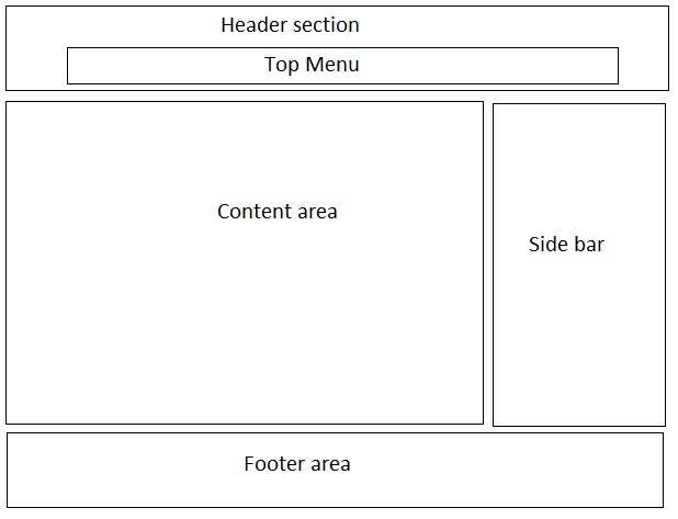
The result responsive wordpress template layout would look something like below image in any major browsers;
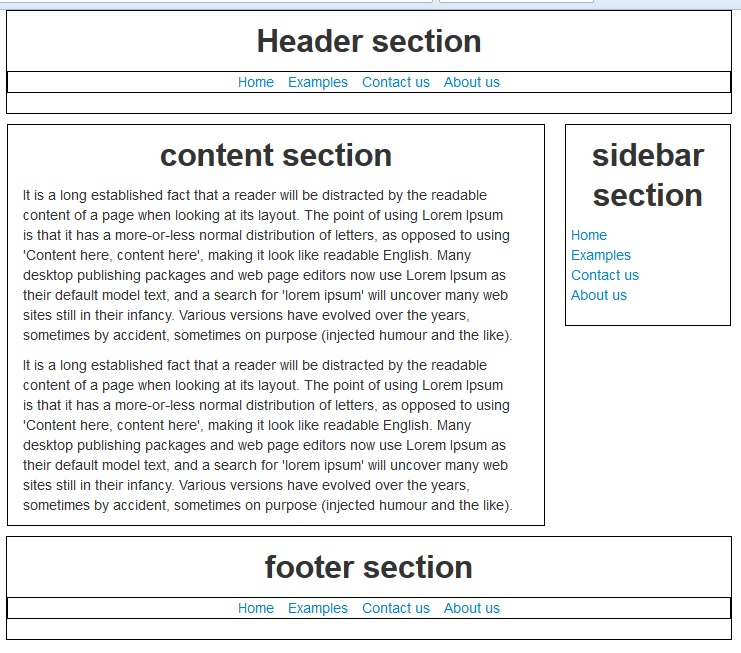
To produce a result like this, you have to add few lines of custom css code into your responsive wordpress theme layout. As you can notice I have only used two style classes in the layout. One is to draw borders around the sections and the other is to add a top margin to sections, rest of the others are taken from bootstrap css files. There are many more features available with bootstrap, you can take a deep look at here. The other biggest benefit with bootstrap css is that you can override any css class to suitable to your theme layout.
You can look at the live sample the htm5 theme layout here
What is a responsive layout?
Responsive design is an approach to develop web pages using flexible layouts call grids, flexible images and cascading style sheet media queries. The objective of responsive design is to build web pages or html layouts that detect the client’s device screen size and orientation(landscape/portrait) and change the layout accordingly. This means one template for all the devices.
A good demonstration of responsive design can be found here
What are media queries?
In Building responsive layouts media queries play the major role in making the html layout responsive. Responsive layout means one layout adopt in to any resolution or any device size.Media queries makes it possible to deploy one style sheet which will make the entire site to work with any device. By using a list of media queries for target devices can make this idea a reality. A media query example shown below;
 @media only screen and (min-width: 768px) and (max-width: 1024px)
 {
    /* css styles locate here */
 }
 @media only screen and (max-width: 767px)
 {
     /* css styles locate here */
 }
 @media only screen and (max-width: 480px)
 {
     /* css specific styles locate here*/
 }
What is twitter bootstrap?
For this responsive wordpress theme we are using twitter bootstrap to make the site responsive. Twitter bootstrap is css/html framework allow to create 12 column flexible grid layout. The flexible grid layout in bootstrap allows the template to be responsive and work on any device without any issues. Bootstrap give codes most of the common css features at your finger tips, such as styles for all the common html controls menus etc. The biggest advantage is all the styles it provide can be configured to the theme colors of your own by overriding them. For more details visit here
How to integrate twitter bootstrap with wordpress
At this stage you are ready to create the them. Following steps will allow you to create responsive wordpress theme.
First you need to create a new folder in the themes directory of your wordpress install.
Copy all the html files and folders into new theme folder.
Re-name the html file as index.php
Add following code block to you css file. In this case it is important that you need to create a empty css file on the new theme folder and add the below code; This will allow wordpress core engine to identify your theme.
/*
Theme Name: WPResponsive
Theme URI: http://wecodeyoursite.com
Author: Wecodeyoursite.com dev team
Author URI: http://wecodeyoursite.com/
Description:"Twitter bootstrp responsive theme
Version: 1.0

*/
Now you can open theme section of your wordpress admin panel. You can notice apart from the default themes there is a new theme call WPResponsive is added into the list. You can activate it and view the site. You can notice that your html layout is there with out the styles.
Now you need to change the reference locations of css and js files using wordpress tags. For this wordpress core engine provides a very handy function call bloginfor(). It accepts various parameters you can take a look at function reference at wordpress codex. it describes all the possible parameters and there out comes. For our purpose we are using the function to get the themes directory as follows;
bloginfo('stylesheet_directory') // returns the themes directory
Now changed css references in the index.php look as follows;
<!--Bootstrap core css file-->
<link href="<?php bloginfo('stylesheet_directory')?>/css/bootstrap.min.css" rel="stylesheet">
<!--To add responsive effects to the layout-->
<link href="<?php bloginfo('stylesheet_directory')?>/bootstrap-responsive.css" rel="stylesheet">
Use the same reference setting for the js files too. Now refresh the theme, you will notice your layout is in place. Lets start coding the theme with wordpress tags, functions and hooks.
Build the basic responsive wordpress theme using twitter bootstrap
Now twitter bootstrap is integrated with wordpress theme. It is time to add wordpress core functionality to it. Lets separate the key areas of the templates. In this case we need header, footer sidebar and the middle content area need to be separate as template parts. You can do this by splitting the index.php file into separate files. Lets start with header.
Create responsive wordpress theme header
Create a new file call header.php. This file name is recognized by the wordpress core engine. Before you do this you need to add some basic comments your theme to identify areas. Comments will separate the areas. Once you are done commenting you can start splitting the theme files. Once you separate the header it will look like as follows;
<!DOCTYPE html><!--start header-->
<html lang="en">
<head>
    <meta charset="utf-8" />
    <title></title>
    <!--To give better divice support-->
    <meta name="viewport" content="width=device-width, initial-scale=1.0">
    <!--Bootstrap core css file-->
    <link href="<?php bloginfo('stylesheet_directory')?>/css/bootstrap.min.css" rel="stylesheet">
    <!--To add responsive effects to the layout-->
    <link href="<?php bloginfo('stylesheet_directory')?>/css/bootstrap-responsive.css" rel="stylesheet">
    <style type="text/css">
        .border
        {
            border: solid 1px #000;
        }
        .topmgn10{margin-top:10px;}
    </style>
    <?php wp_head();?>
</head>
<body>
    <header>
        <div class="container text-center border">
            <h2>
                Header section</h2>
            <ul class="nav border inline">
                <li><a href="#">Home</a></li>
                <li><a href="#">Examples</a></li>
                <li><a href="#">Contact us</a></li>
                <li><a href="#">About us</a></li>
            </ul>
        </div>
    </header><!--End of header-->
In your header file make sure to add wp_head() function call before the end of head tag. This is the most important application hook. Now you need to include this header part in the index.php file. For that wordpress provides another function call get_header(). On top of your index.php file you can call this function as follows;
<?php get_headers();?>
If you have a different name for the header file you can pass that as a name parameter to get_header(). In the responsive wordpress theme now you need to include the dynamic menu tags. Before you do that need to create a file call functions.php. Include following lines of code to make the theme menu enabled. Your functions file look as follows;
<?php
// enable menu support in the theme
add_theme_support( 'menus' );
// This theme uses wp_nav_menu() in one location.
register_nav_menu( 'primary', __( 'Primary Menu', 'k8responsive' ) );
 ?>
The first function add_theme_support() accepts few parameters. In this scenario we are using it to enable theme support to wordpress menus. The second function allows to register menu locations. With this line of code it will allow users to define primary menu, in this case it will be the top menu.
Now we can change the header menu setting. We can include follow code block to enable header menu.
<?php
$defaults = array(
'theme_location' => 'primary',
'container_class' => false,//unless you create a menu in the admin panel and assign it will not work
'menu_class' => 'nav border inline', );
wp_nav_menu( $defaults );
?>
Remember to create a custom menu and include it in the primary menu section otherwise the wrapping div will remain. In the function call we are passing the bootstrap style classes, those classes will apply bootstrap styles to the wordpress dynamic menu. Once you are done with the header.php you can create necessary pages to make the top menu.
Create responsive wordpress theme footer
Next step create the footer.php. Create a empty file and name it as footer.php and copy the html content within the footer comments into footer.php and save it. Since we are going to have a footer menu need to register another menu location in the functions.php and add the menu rendering php code in the footer.php. Your footer file will look as follows;
 <footer class="topmgn10"><!--start footer-->
    <div class="container border text-center">
      <h2>footer section</h2>
        <?php
            $defaults = array( '
             theme_location' => 'footer',
              'container_class' => false,
              'menu_class' => 'nav border inline',
                );
           wp_nav_menu( $defaults );
         ?>
    </div>
</footer>
<!--For adding jquery effects to the layout in case-->
<script src="http://code.jquery.com/jquery.js"></script>
<!--Bootstrap javascripts required for the layout-->
<script src="<?php bloginfo('stylesheet_directory')?>/js/bootstrap.min.js"></script>
<?php wp_footer();?>
</body>
</html><!--end footer-->
In the footer also you need to add the wp_footer() application hook. As you can notice we are again passing the bootstrap style classes into footer menu that will make the footer bootstrap enabled.
Create responsive wordpress theme sidebar
Next step creating the sidebar. Create another empty php file and name it as sidebar.php and copy the html content form index.php within the sidebar comments. In the sidebar we can enable the widgets by adding following code in the functions.php.
//to enable theme widgets
if ( function_exists('register_sidebar') )
register_sidebar();
Once you have done that you can call the widget code in the sidebar.php as follows;
<div class="span3 border">
      <h2>sidebar section</h2>
      <div class="span11">
          <ul class="nav text-left">
              <?php
                   if ( !function_exists('dynamic_sidebar') || !dynamic_sidebar() ) :
                  endif; ?>
          </ul>
      </div>
</div>
Now you can add any of the default widgets in the list to your sidebar. As you can notice the widget area is surrounded with a ul tag with bootstrap style classes all the other html tags are styled with bootstrap classes. The sidebar is fully bootstrap enabled.
Create responsive wordpress theme loop
Now we need to create the most important part, that is to show content in the index page. You can do this by adding the wordpress loop logic into index.php file as follows.
<?php get_header();?>
<!--start of content area-->
<div class="container text-center topmgn10">
    <div class="row-fluid">
        <div class="span9 border">
            <?php if ( have_posts() ) : ?>
                <?php while ( have_posts() ) : the_post(); ?>
                <div class="span11">
                    <h2 class="entry-title"><a href="<?php the_permalink(); ?>"><?php the_title(); ?></a></h2>
                    <?php the_content(); ?>
                </div>
                <?php endwhile; ?>
            <?php endif; // end have_posts() check ?>
        </div>
        <?php get_sidebar();?>
    </div>
</div>
<!--endof content area -->
<?php get_footer();?>
Above logic will display the basic page contents. If you don’t have any specific layout for display of posts you can copy the same index.php file and rename it as post,php, This file will display the individual post contents, Most importantly now you can see your responsive wordpress theme is fully responsive. How you can check this? resize the browser in to smaller size you can notice layout adjust according to the size. So it is responsive. Twitter bootstrap does it automatically for you all what you need to do is call the css file on top.
So your simple responsive wordpress theme layout completed. You can download this responsive wordpress them and enhance it to the layout you want.with below link;
Download Basic responsive wordpress theme layout.
Share your thoughts